Tiger vs Dragon UKIYO-E
06:00 May 20, 2016 |
design Japanese color ink painting Japanese ink painting Carp Japanese dragon
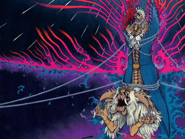
 An illustration of Tiger vs Dragon was completed.
It took effort with a conventional Artwork most. The original Artwork is more attractive.
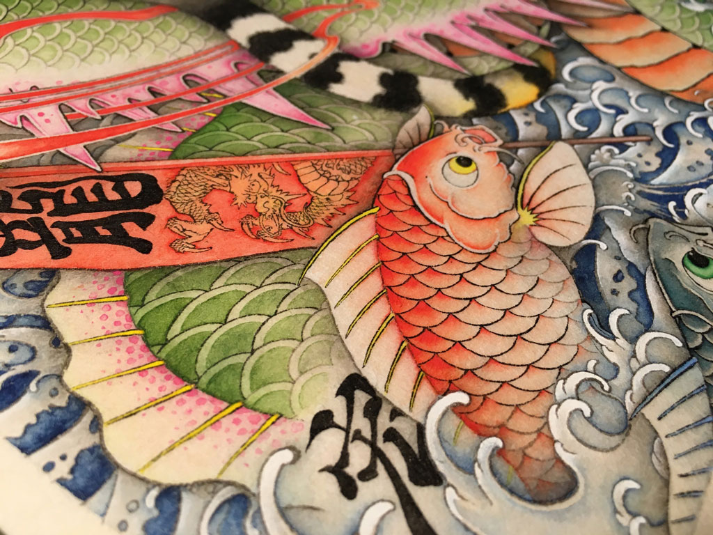
The white paint for the Japanese painting called the whitewash contributes.
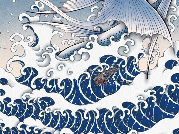
The wave stands out as if there is a three-dimensional impression.
The white paint for the Japanese painting called the whitewash contributes.
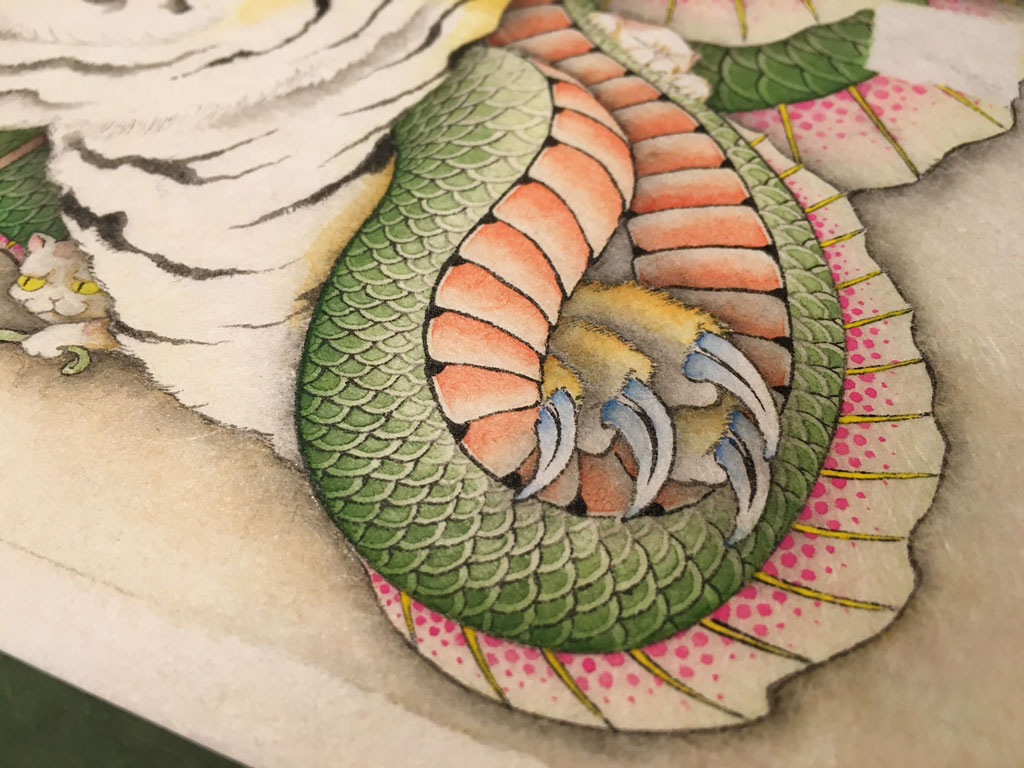
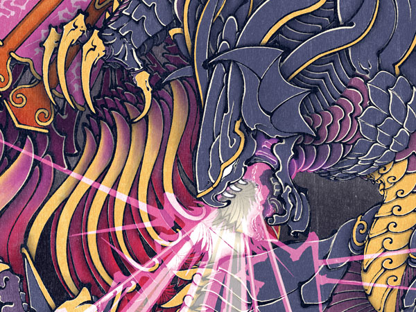
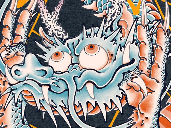
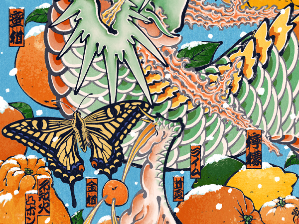
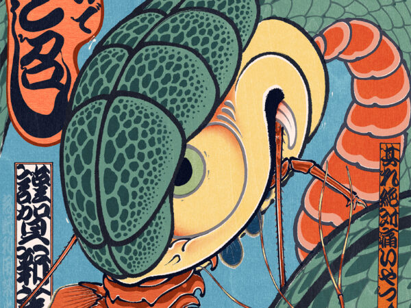
The scale of the dragon needs perseverance.
A dot pattern has a rule.
However, an element of the sensitivity is stronger than an article of HOWWW.
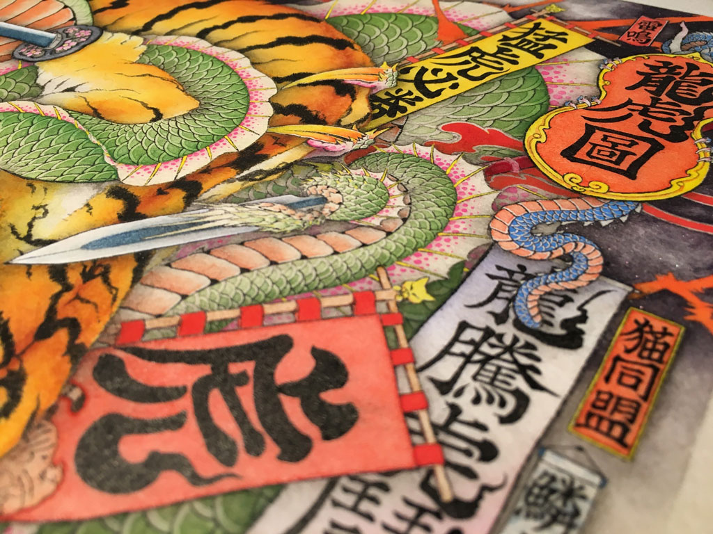
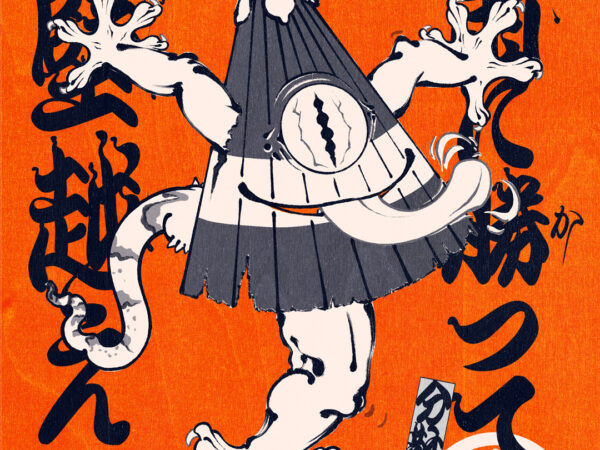
I employed a lot of kanjis in this art work.
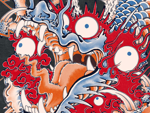
The blue of the dragon is beautiful.
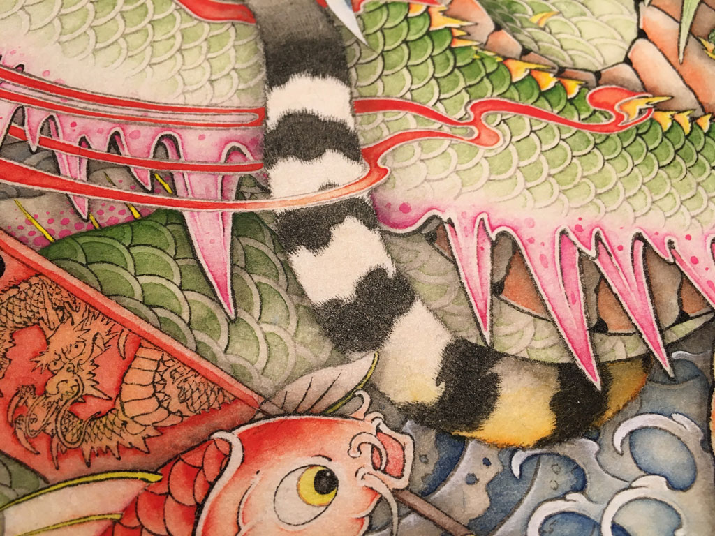
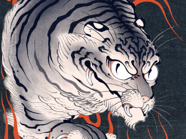
The tail of the tiger has the narrowest line in this picture.
I respect a tiger of Kirei Kameoka.
However, it was impossible in my present technique.
It is different from the tiger of Kirei Kameoka, but thinks that it became the ukiyoe print-like tiger.(/・ω・)/
This is my Tiger vs Dragon.
News
Tiger vs Dragon became BYO-BU-E print Products page
This art became BYO-BU-E print. This products made by Tokyo anilab.
Tokyo anilab lets new art and old art fuse and makes a lot of splendid products.


